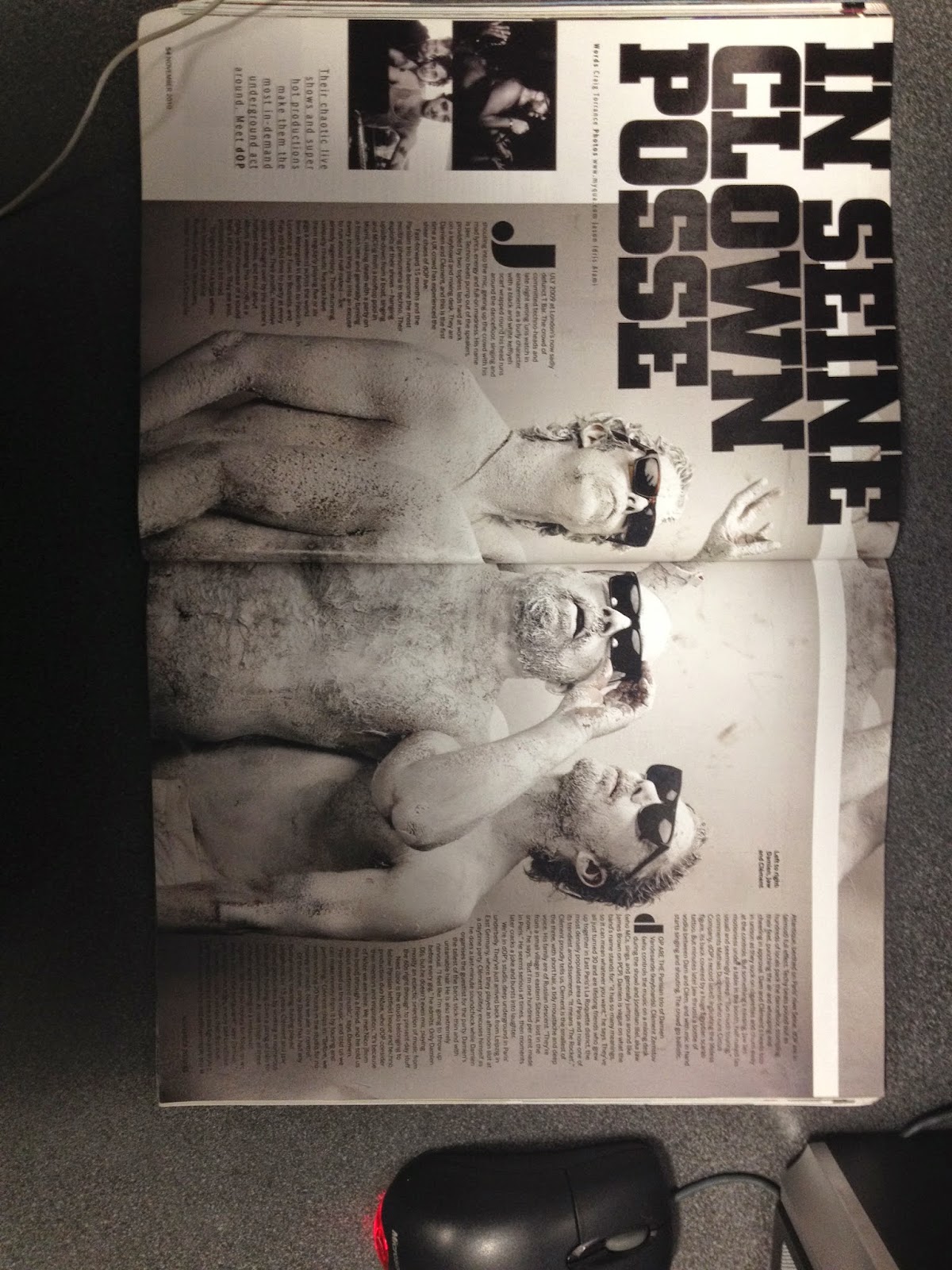
After looking into existing music video magazines we as a group established that the mixmag magazine would be a ideal choice as it conforms to all the conventions which our found in the track which we are working with. Furthermore this magazine is dominantly based upon the Dance genre within the music industry, therefore using this specific media platform to advertise our track is the most ideal way to gather attention.
Through looking into existing music video advertisement pages we see that the common features employed into the design of the advertisements are usually bright and vibrant colours with a strong use of typography to reinforce the bands image or general promotion. Additionally this music magazine is predominately aimed at a younger audience meaning that they must apply to what the consumer wants to see. Therefore a higher level of imagery is used in comparison to the amount of written text included I the magazine, generally if the consumer wants to read more about the article/advertisement they can do so by following a link onto the mixmag website which consists of the whole article. Furthermore the text used in these advertisements must be simple and consists allow the consumer to sustain interest in the advertisement.
When observing the general layout of these advertisements we see tat a white background is used as the base colour for the page, therefore black text is used with the imagery of the advertisement placed on top of this white back ground. Even if text is found to be placed over an image generally a white box will be created (like a text box) to allow consumers to be able to easily read the information being displayed. Expanding on the layout I must comment on the way in which the magazine layout has a variety of different setups, varying from a double page spread to a small advertisement taking up a third of an A4 page. As far as shape is concerned a variety of different shapes can be used to add a sense of texture to the advertisements, meaning they will be more interesting to the eye, opposed to sticking to a basic rectangular/square set out.


No comments:
Post a Comment